|
|
TEXT TOOL continued |
|
I'm sure by now you have all seen some of the kewel text effects out there on webpages and wondered how it was done. Most of them are all really simple. People seem to like a gold, glass, shiny, silver and cutouts about the most I think so we will start off with some 3-D text and go from there. Open a new image, 500 x 500, white background. Select your TEXT tool, click the new image to open the text dialog box and chose a font. (*** Note.. when try to do special effets with text it is best to use a wide font, otherwise when trying to apply certain effects there is "not much there" for PSP to apply it too. If you just HAVE to use that one font that some goofball off one of Bonesy's list sent to you, or a friend of yours then you can always go to SELECTIONS/ MODIFY and expand it a pixel or two so that you can apply the effects to it. But even this does not work well most of the time. Always make big and resize. ) For this particular one I with with the usually because I know everyone will have it, Arial, but you want to use another go ahead. Make it large, 72. Pick your favorite color and type in name. |
|
Next go to IMAGE/EFFECTS and CUTOUTS. Set the SHADOW to black, 100 for the OPACITY, 100 and both OFFSETS to -2. Then chose SELECTIONS/MODIFY and CONTRACT it by 2. Now apply another CUTOUT effect, same as before but lower the OPACITY to about 90 this time. Prettty nifty huh? lol |
|
| One of the most popular is gold, there are several ways to create gold text and each font will give a different end result. So any tutorial that you follow if not using the same font you made need to make some minor adjustments here and there to get the same effect. I will show you a couple of different ways with settings to be used as general guidelines. You can play with the settings to get the exact effects that you like. To get a really good gold text it is best to use a filter. However some people don't have the filters and still want the gold text, so here are a couple methods to get it WITHOUT filters. | |
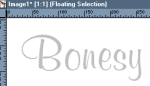
| Open a new image 300 x 300 white background. Select your TEXT tool. Set your FOREGROUND color to the light grey in the color palette (RGB192/192/192) and the background color to white. Click the center of your new image and then you should be presented with your text dialog box. (PSP 6 users.. make sure the FOREGROUND color here is the the light grey). FLOATING enabled, and the antialias checked. I use my MURRAY HILL font here at size 72. Enter the name or whatever you want as the text and chose ok. You should then have your "text" in light grey on your canvas with the marching ants around it. Now chose SELECTIONS/HIDE MARQUEE. |
|
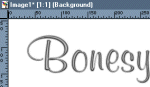
| Now chose SELECTIONS/MODIFY and FEATHER to 2. You will not see any changes since we hid our marquee, but the selection just expanded by two pixels, with soft edges around it. Now change your FOREGROUND color from the grey to white and we are going to apply a hotwax coating. Chose IMAGE/OTHER and HOTWAX COATING. Your image should resemble mine, to the right here. |
|
| Now chose IMAGE and SHARPEN to help clear the fuzzies a bit. Then chose COLORS/ADJUST RED.. GREEN and BLUE. Set the setting to RED 100, GREEN 75, and the BLUE to 0. Your text should now be a gold color. At this point some people would stop and be perfectly content with it and you may if you would like but there is a couple more things we could do to give different gold effects. First make a DUPLICATE copy of this image, and save it and send to the list. Then go back to the original . To the right are a couple of examples that I did with different fonts. |
|
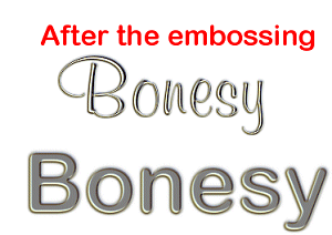
| Going back to the original image, after you adjusted the RED,GREEN, and BLUE. Chose IMAGE, OTHER and then EMBOSS. See right for the narrow and wider fonts and what they should resemble at this point. I am posting both in the tutorial so that anyone using a more narrow font can see how it looks on the narrow as opposed to the wider font. |
|
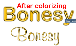
| Now go to COLORS/COLORIZE and set the HUE to about 32 and the SATURATION to about 237 or so, again I say you may need to adjust these by a few numbers to get the effects that you like. 237 was what I used on the ones to the right here. Bare in mind that I have resize these down to save loading time for these pages. If you would like to see the full size version of the examples just click here. |
|
| At this point you can add a drop shadow if you like to give the text more of a 3-d Look. Go to IMAGE/EFFECTS and DROP SHADOW. On the narrow I used a black shadow with 100 OPACITY, BLUR of 4 and both OFFSETS to 2. On the larger one I had all the same except set the BLUR to 2. Do you see what I mean about the more narrow text and how the effects do not show as well? |
|
There are just endless possiblities with text and ways to display it. You can change the colors real easy. Below are a few variations of different colors. To change the colors you use the same steps up until the adjusting of the RGB, there play with the settings til you find something you like. You can also use the COLOR/COLORIZE function as well. Get creative, use the FLOOD FILL tools, anything you can get your hands on. lol |
|
|
|
Make atleast 3 different versions of some sort of text. Using any of the methods above, add colors, different shadows everything and when you are finished post them to the list so the rest of us can see what you have done. |
|
|
|
|
|
This
page last edited on December 7, 1999 |
|